01 / THE TASK
Build a complete travel brand for Armenia
Develop positioning, brand concept, naming, logo, visual identity and a scalable content system for a travel project about Armenia.
Positioning, naming, logo and a whole emoji-driven content system for a travel brand about Armenia.
Client
Hello I am . AM
System
What we did
Layers
TL;DR
We built the brand from the name up: the I am / AM wordplay, the positioning, the logo system, the palette and type.
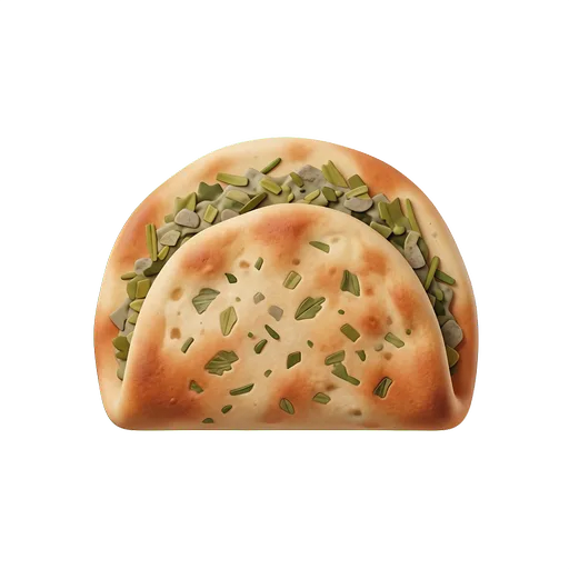
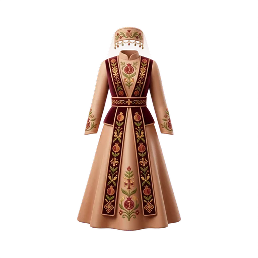
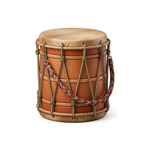
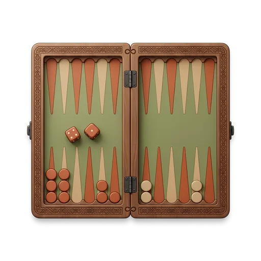
Then we turned it into a working content system — 50 custom emoji objects, four editorial directions — and automated the production of posts, reels, carousels and news on top of it, plus the website.
CONTEXT
HELLO I AM. AM is a travel and cultural brand that presents Armenia through contemporary visual storytelling.
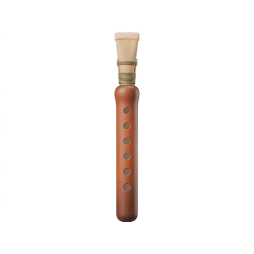
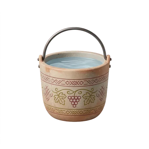
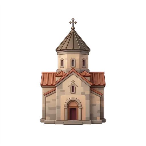
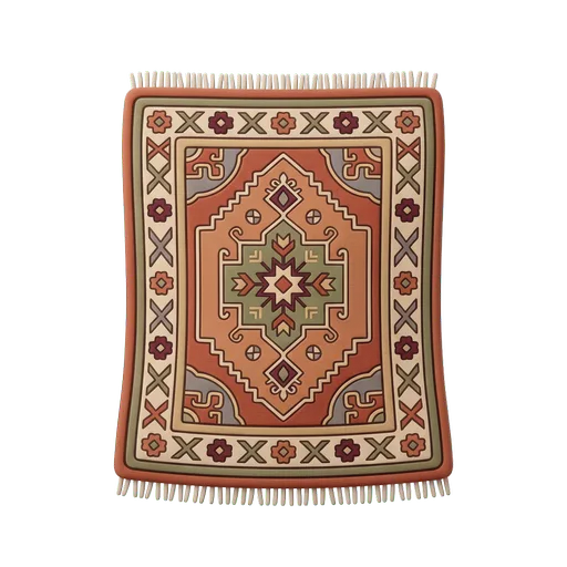
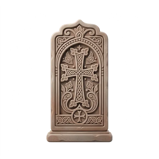
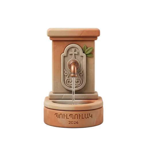
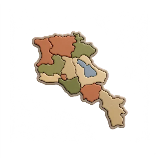
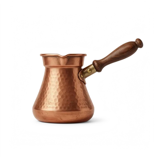
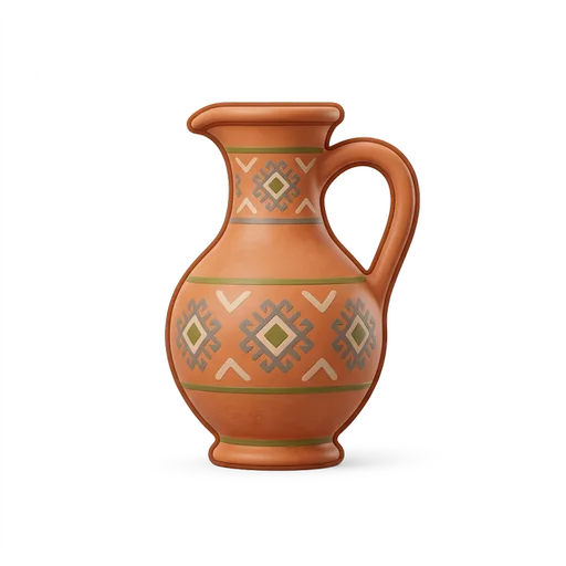
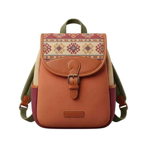
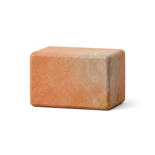
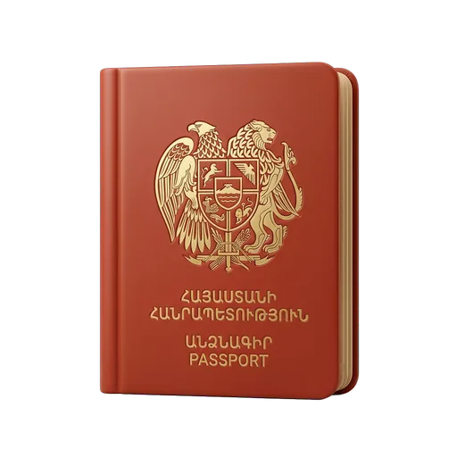
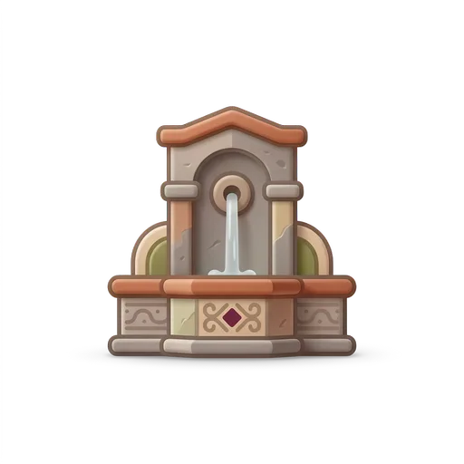
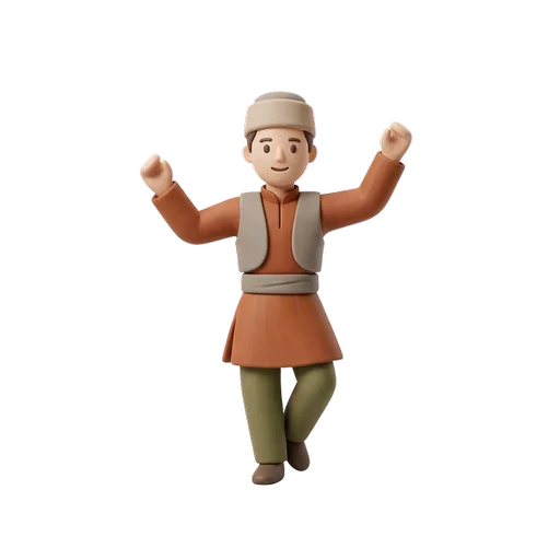
Instead of relying on conventional tourism imagery, the project introduces the country through objects, rituals, places and everyday details.
01 / THE TASK
Develop positioning, brand concept, naming, logo, visual identity and a scalable content system for a travel project about Armenia.
02 / OUR SOLUTION
The name is built around a simple wordplay: I am as a personal introduction, and AM as the country code for Armenia.
The brand allows Armenia to introduce itself directly — human, contemporary and free from conventional tourism clichés — through a flexible system of symbols, emojis and objects.
01 / POSITIONING
The name is built around a simple wordplay: I am as a personal introduction, and AM as the country code for Armenia.
The brand allows Armenia to introduce itself directly, in a way that feels human, contemporary and free from conventional tourism clichés.
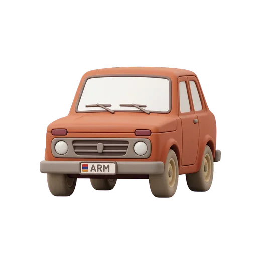
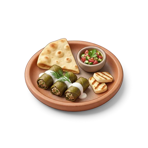
The visual identity extends this idea through a flexible system of symbols, emojis and objects that represent different sides of Armenian culture.
02 / LOGO
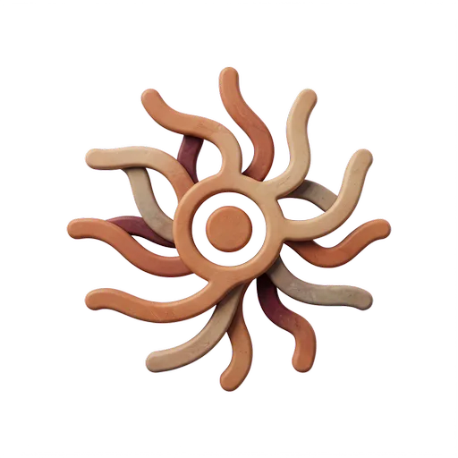
The logo transforms AM into an expressive visual symbol.
am







03 / IDENTITY
Warm cream, deep ink and one red accent — the emoji palette adds yellow, blue and green in small doses. Each column’s width shows how much the color works.
03 / IDENTITY
Instrument Sans carries the wordmark, Space Grotesk does the headlines — IBM Plex Sans and Mono handle the everyday work.
03 / IDENTITY
The objects do the talking, so the layout around them stays deliberately plain — one object, one frame, one line.
04 / CONTENT SYSTEM
Each direction represents a different way of discovering the country. They are editorial lenses through which Armenia is presented, not service categories.
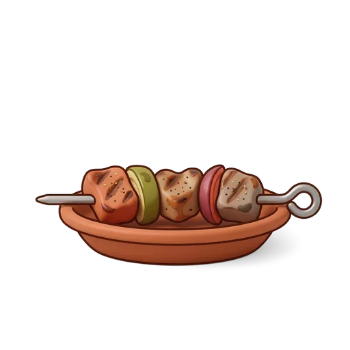
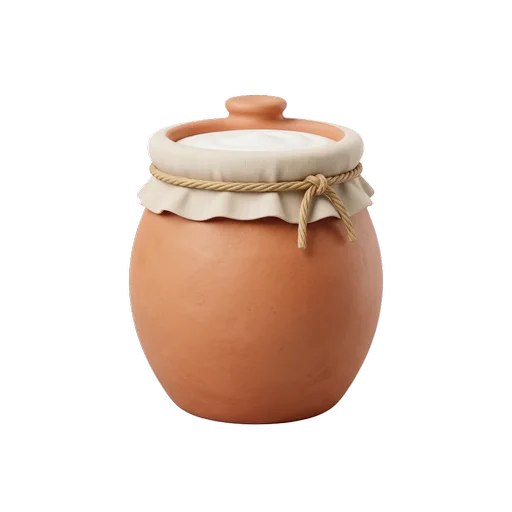
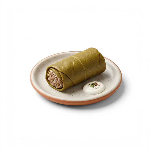
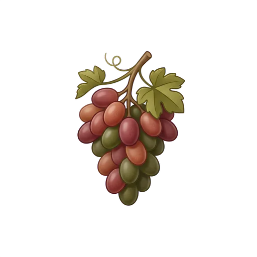
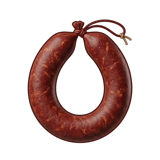
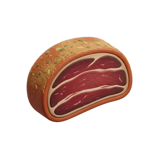
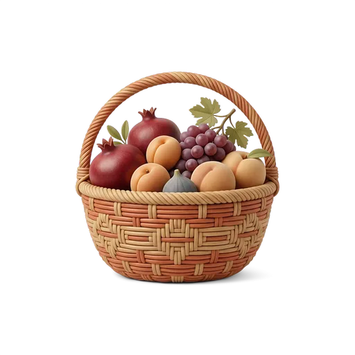
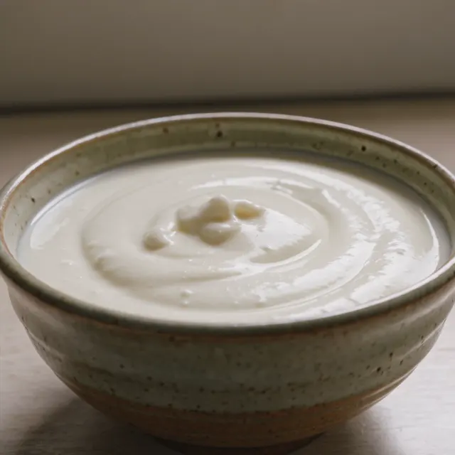
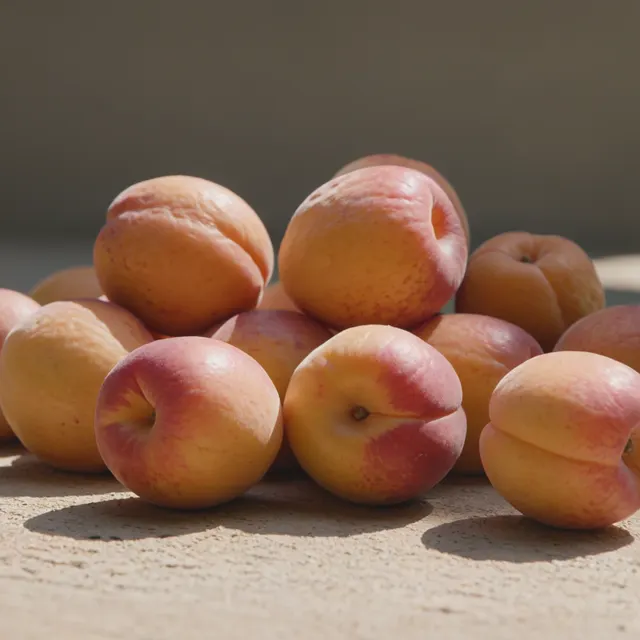
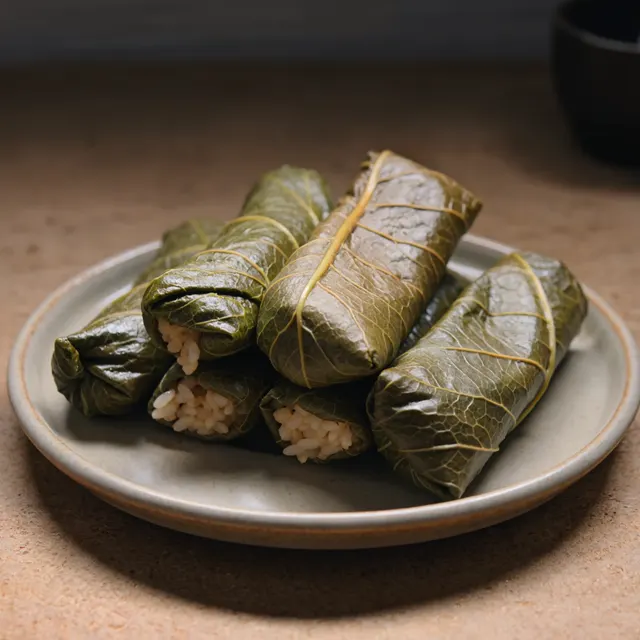
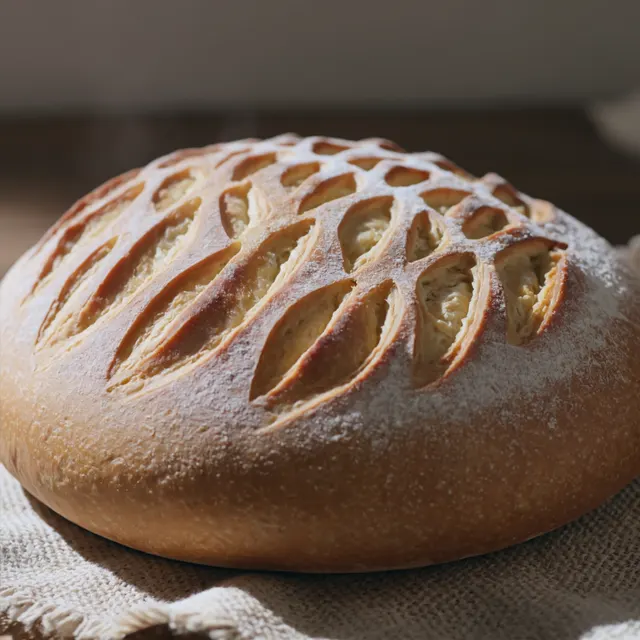
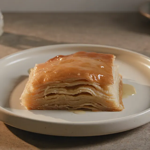
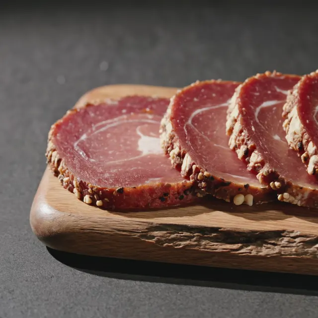
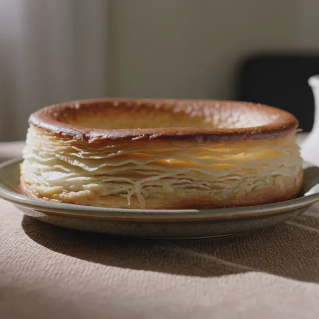
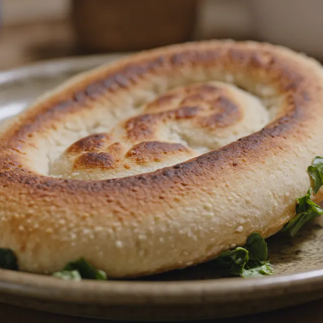
Dishes, markets, tables and food rituals become compact story triggers for the brand.
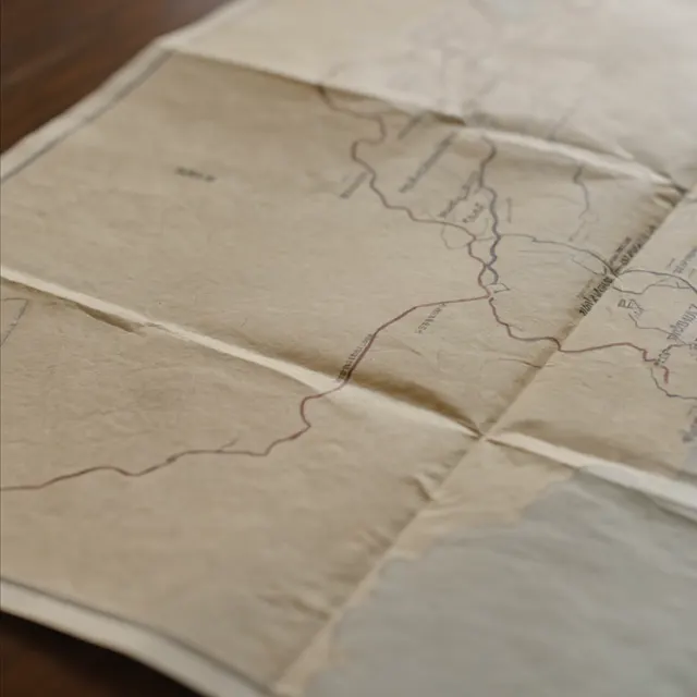
Routes, cars, maps and movement keep the country active instead of static.
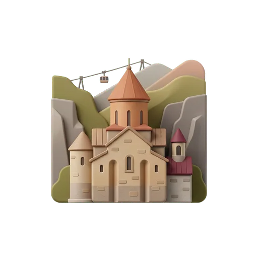
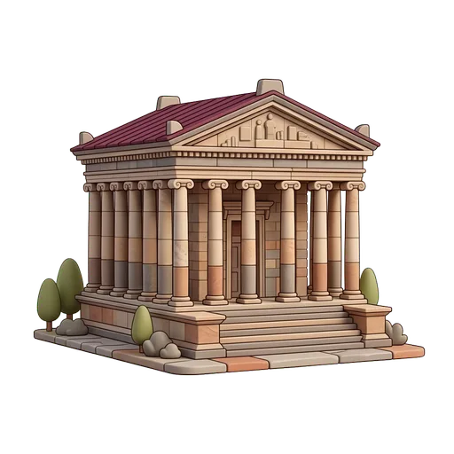
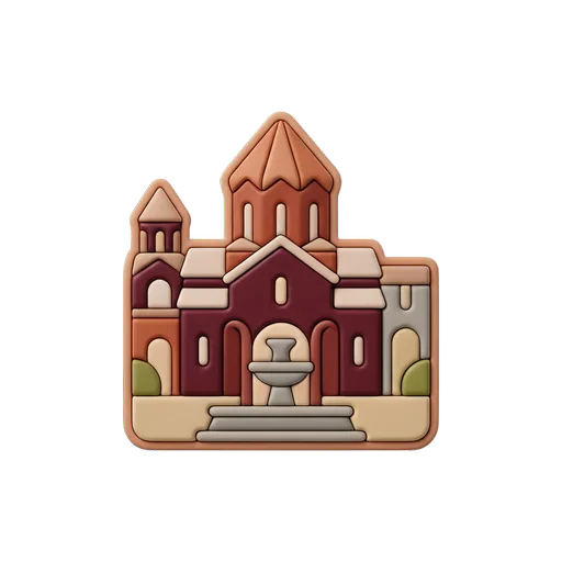
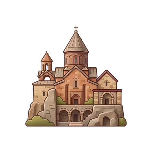
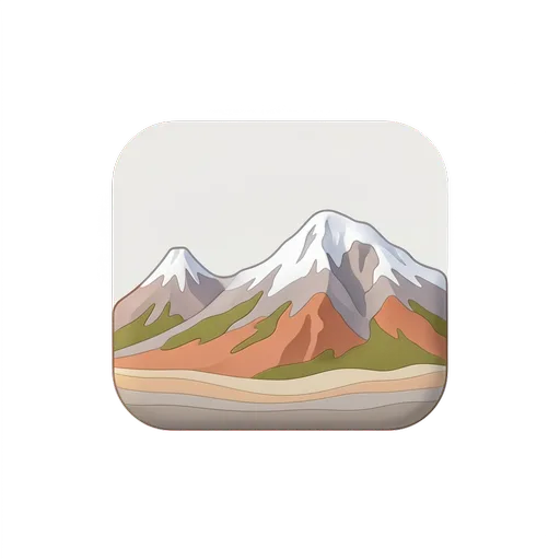
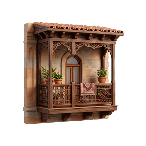
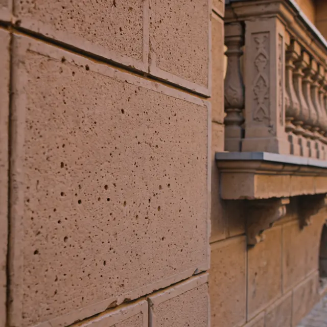
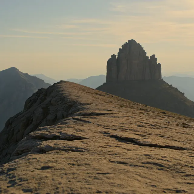
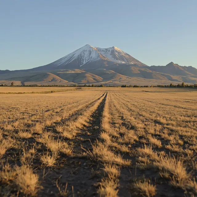
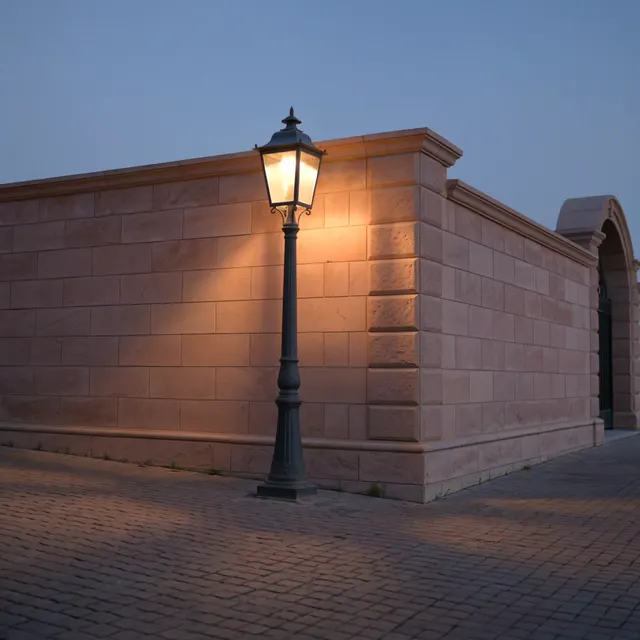
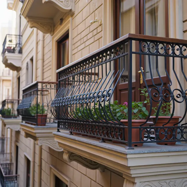
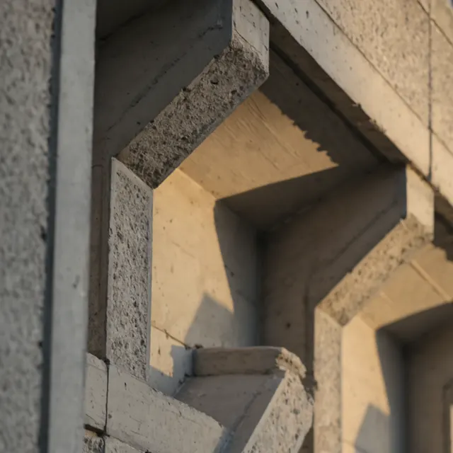
Cities, mountains, monasteries and interiors show Armenia through places with character.
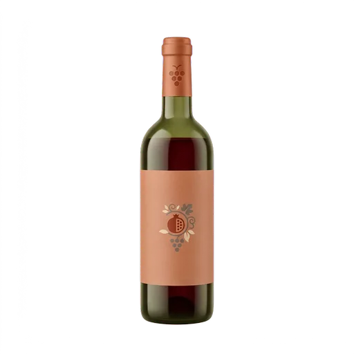
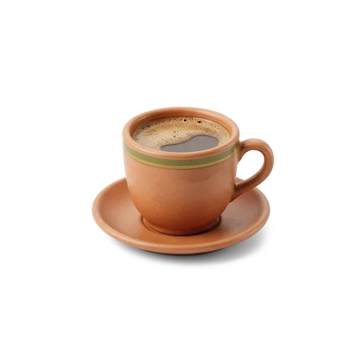
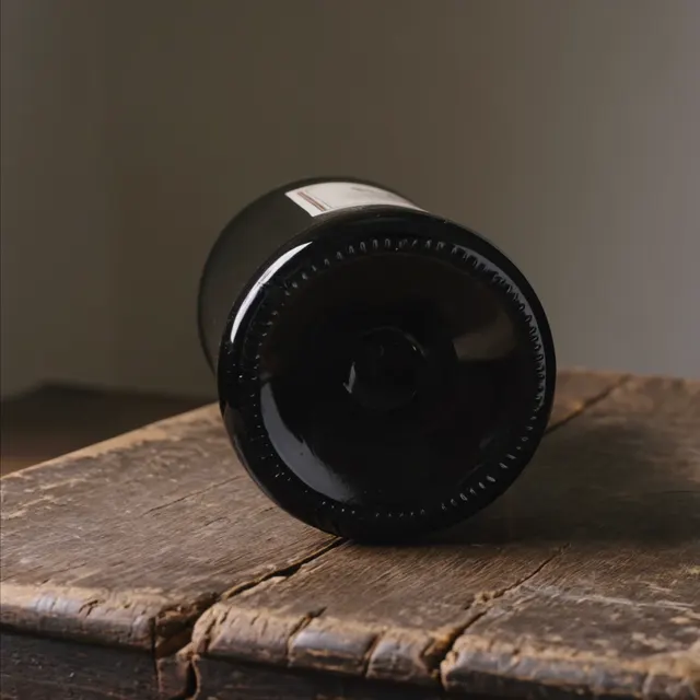
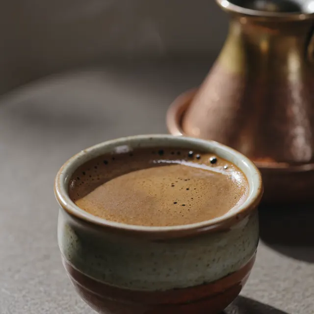
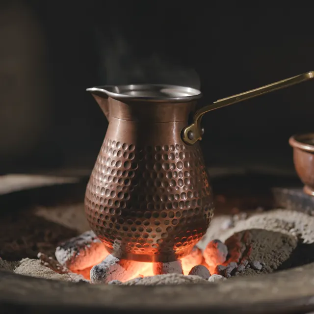
Coffee, wine, music and everyday gestures turn culture into human-scale moments.
04 / CONTENT SYSTEM
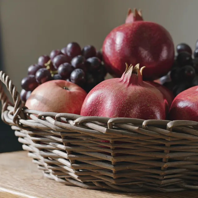
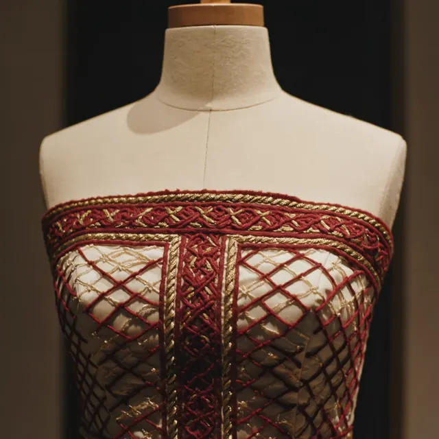
Instead of presenting Armenia through familiar landmarks and panoramic views, the project tells the story of the country through objects, details and everyday rituals.
Food, roads, places, objects and small cultural moments become a visual language for experiencing Armenia as a living culture rather than a traditional tourist destination.
05 / PRODUCTION
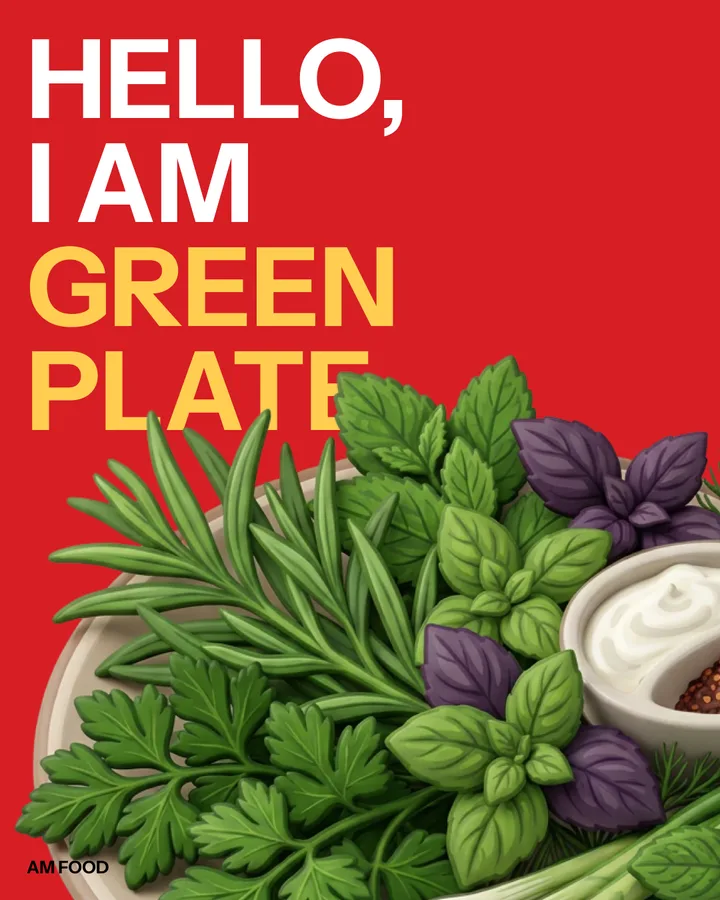
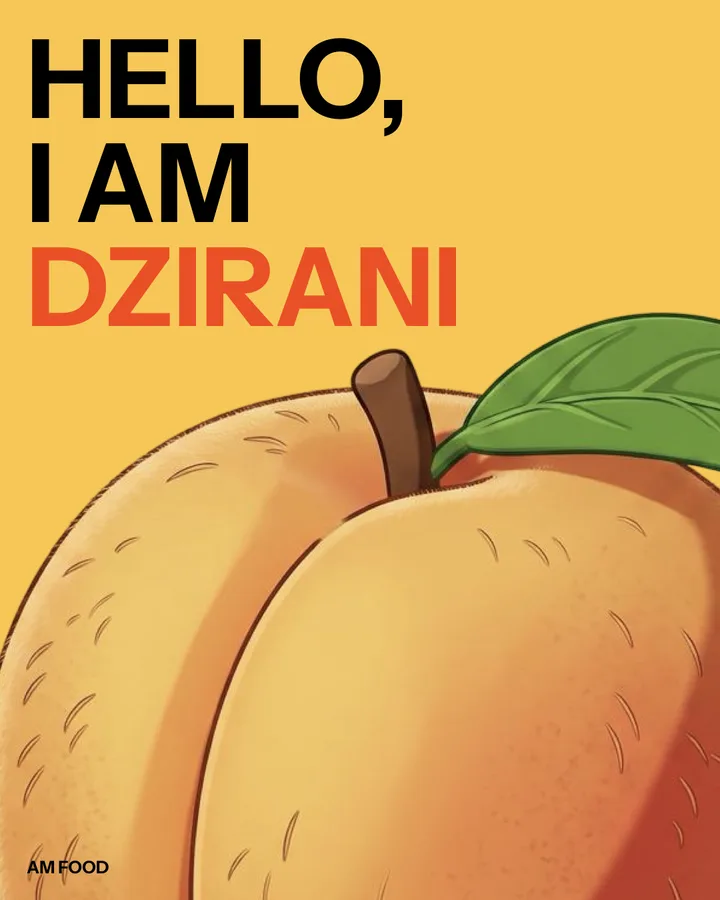
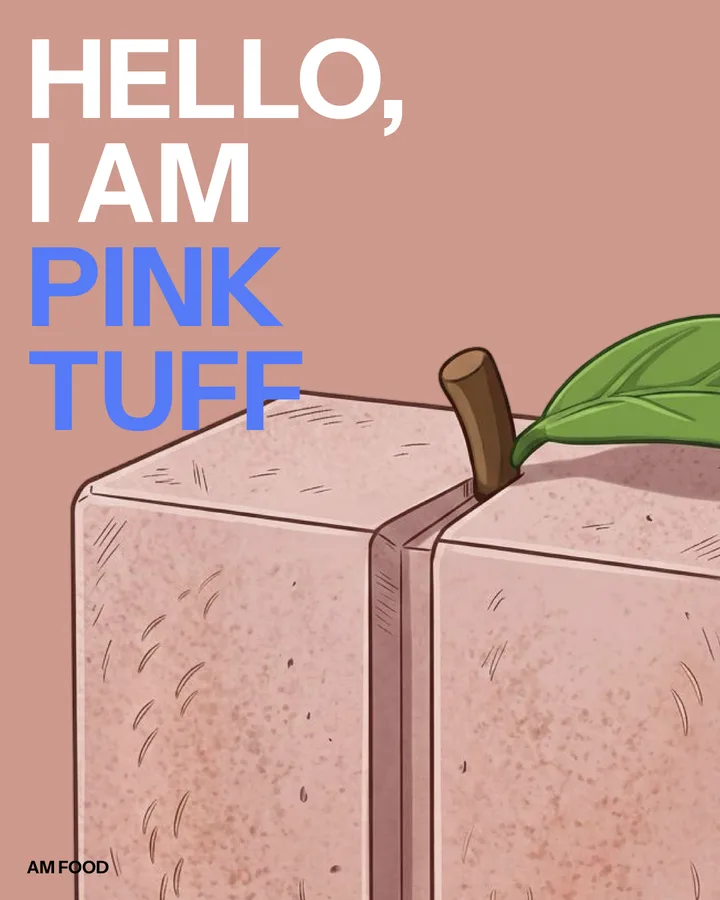
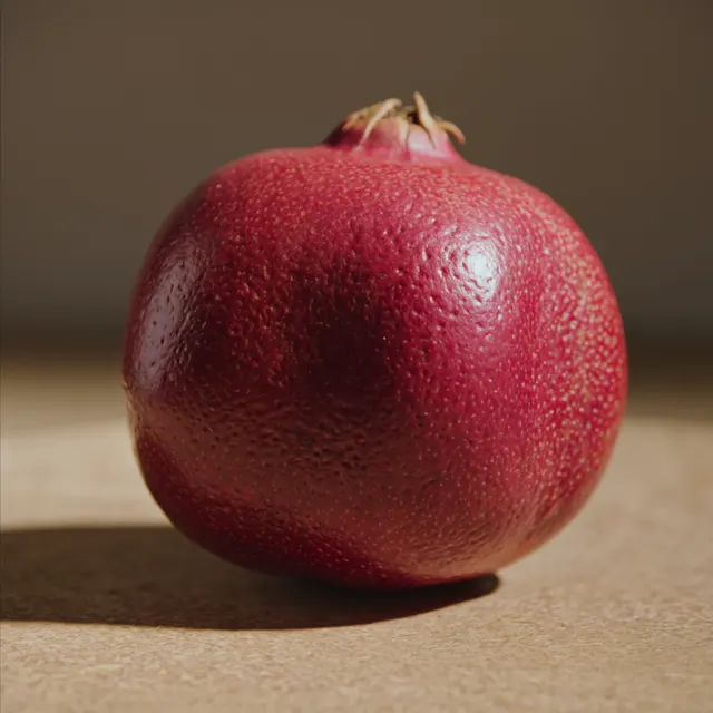
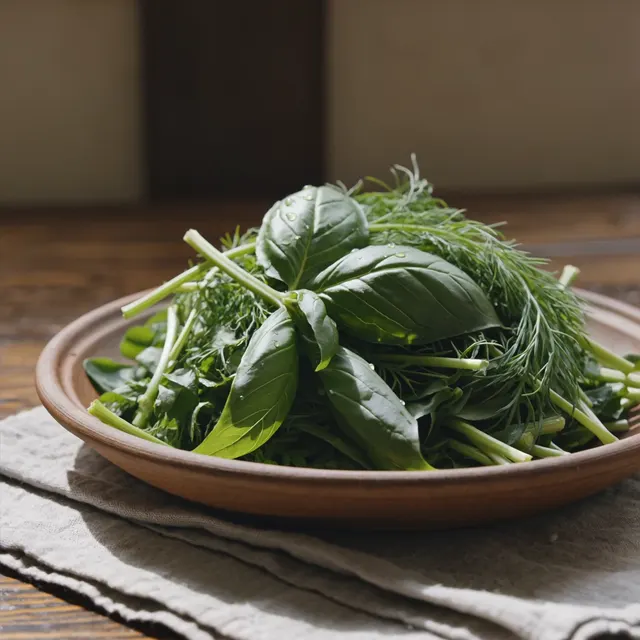
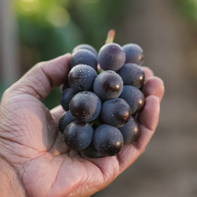
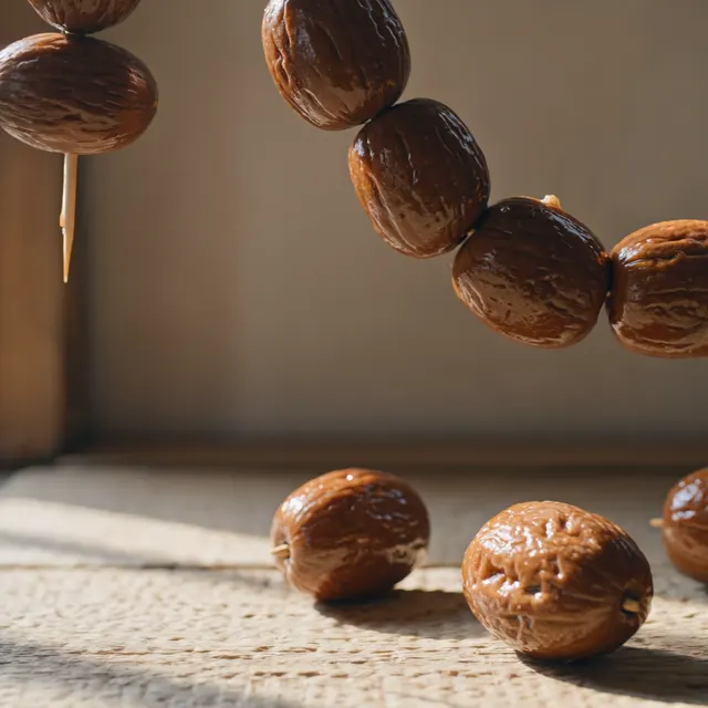
Static social posts are built around individual objects to show how the concept becomes a repeatable content format.
The layouts stay visually consistent while each object keeps its own character.
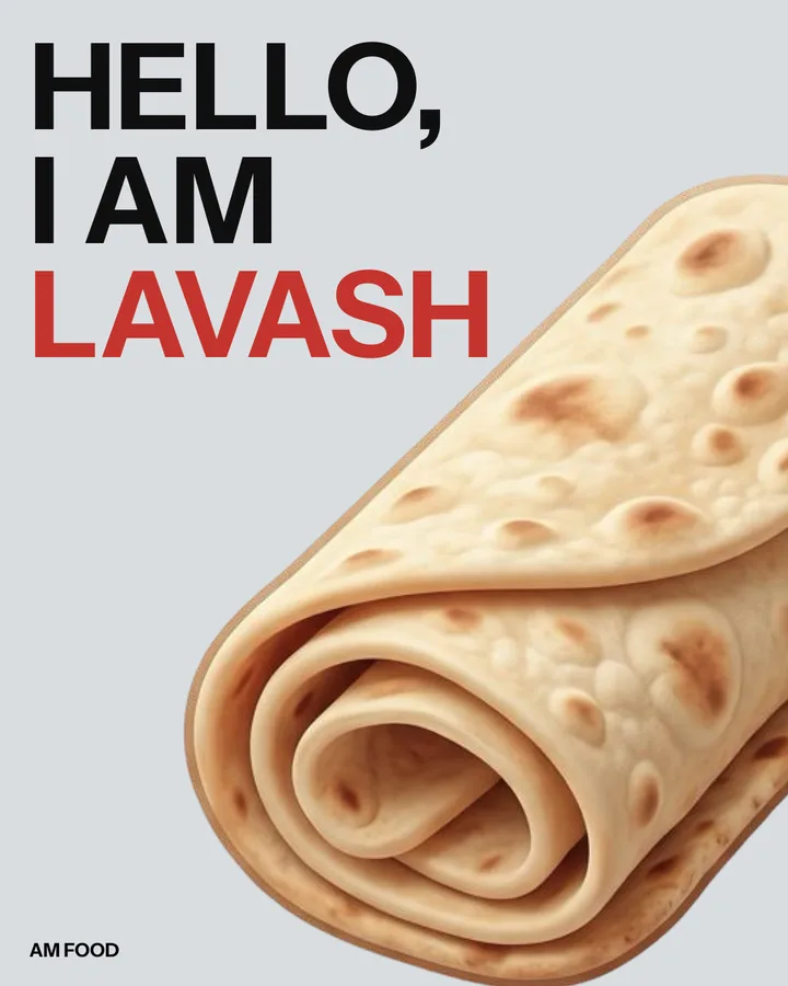
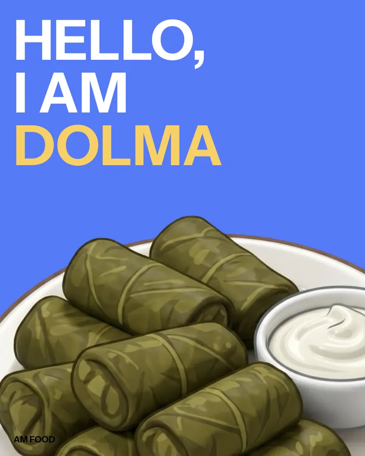
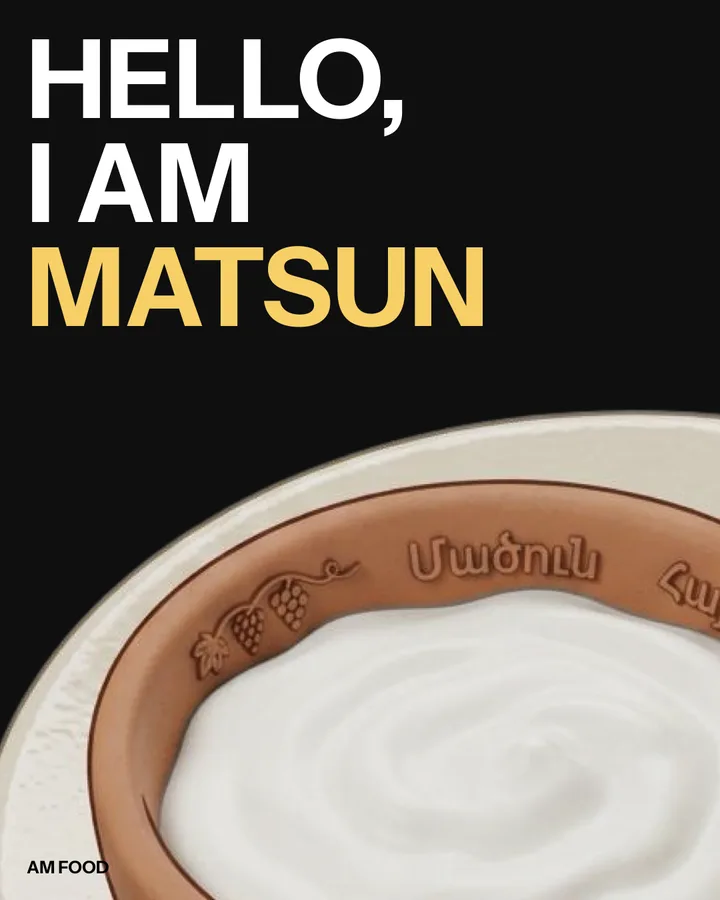
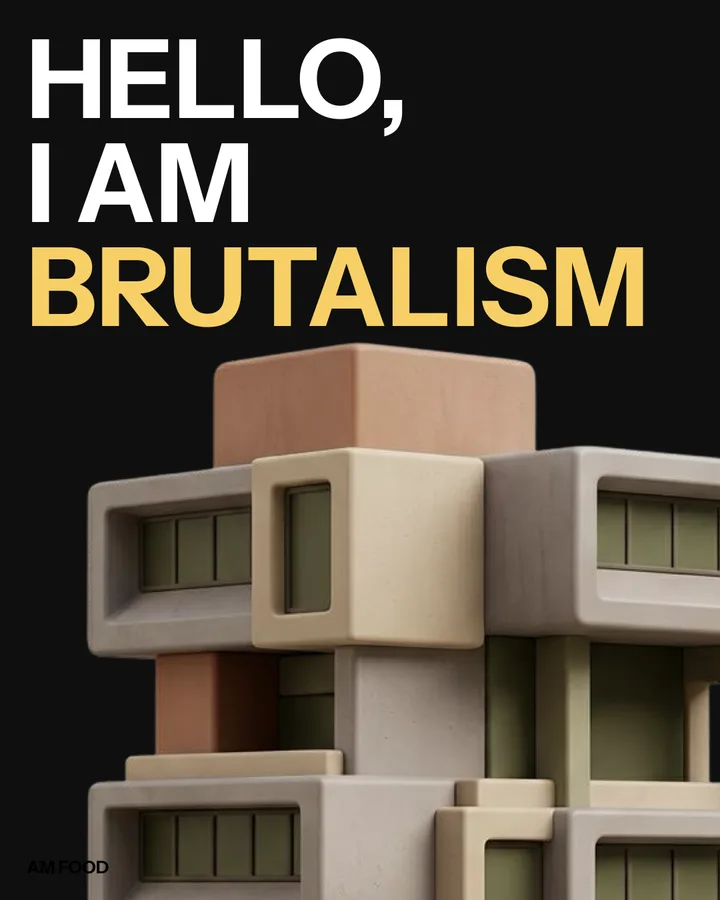
05 / PRODUCTION
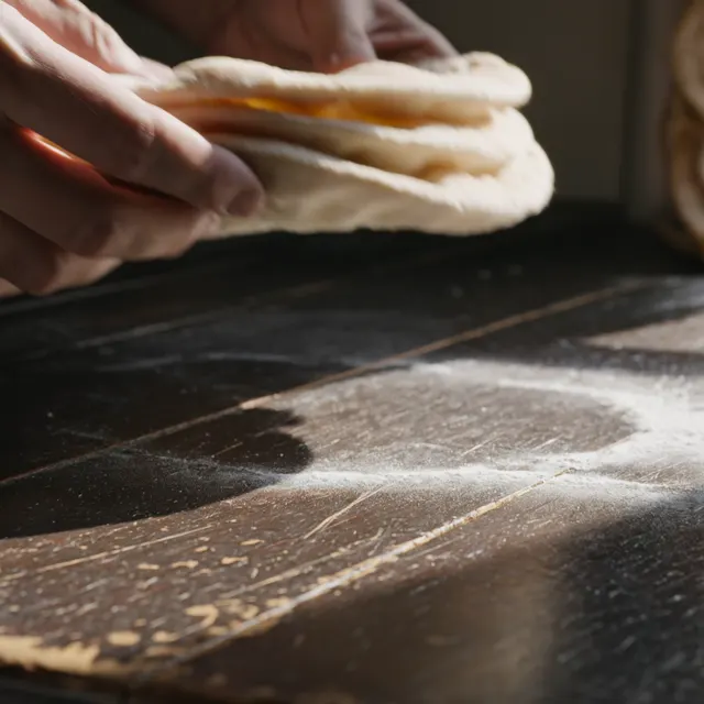
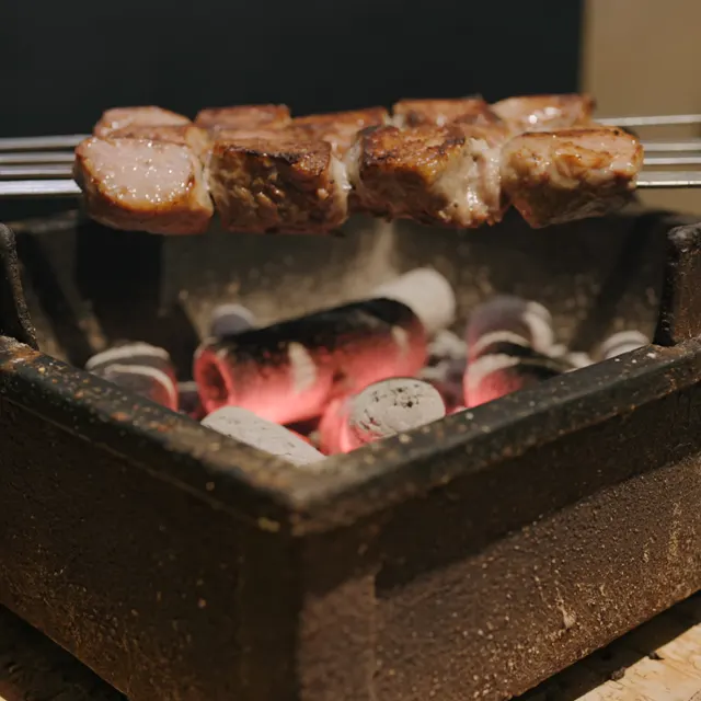
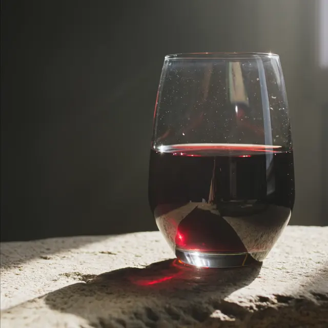
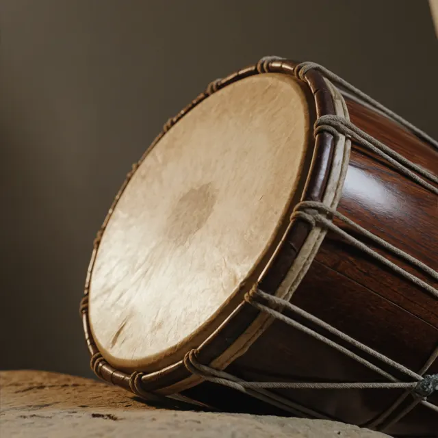
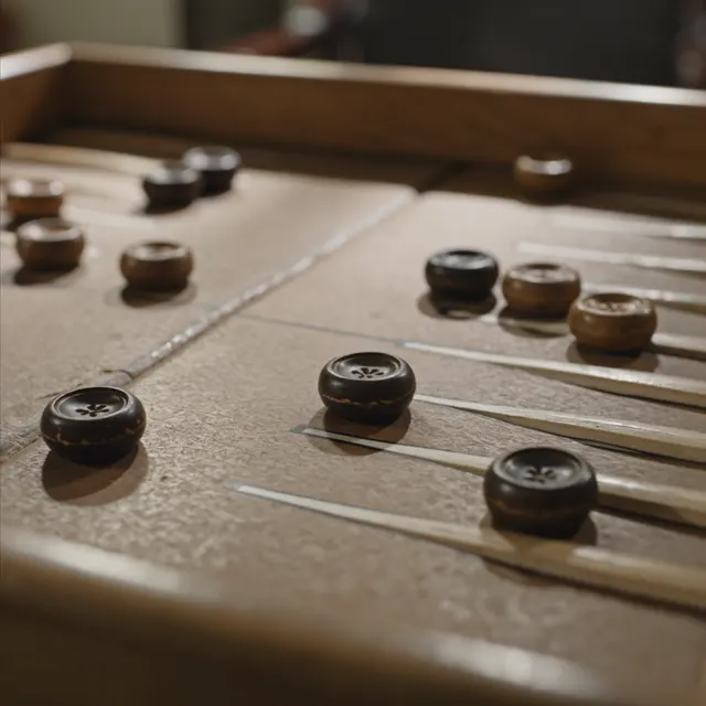
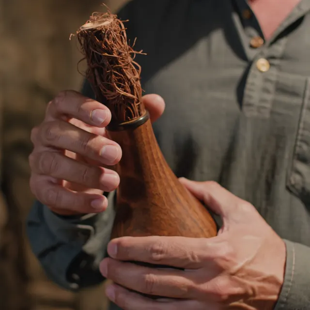
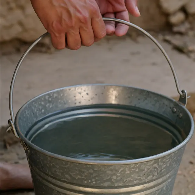
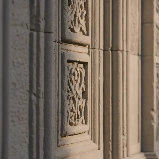
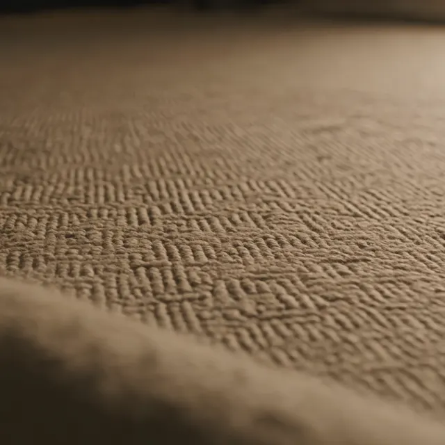
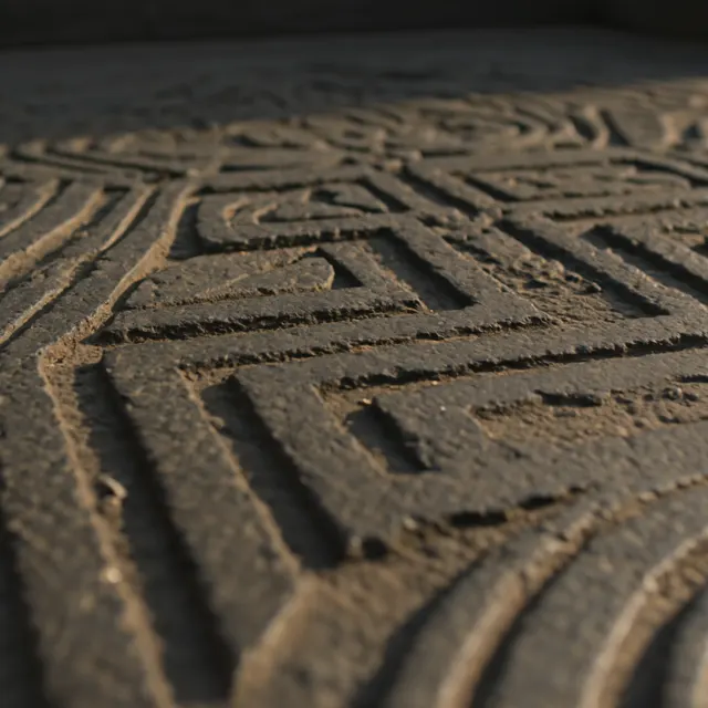
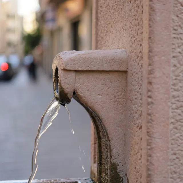
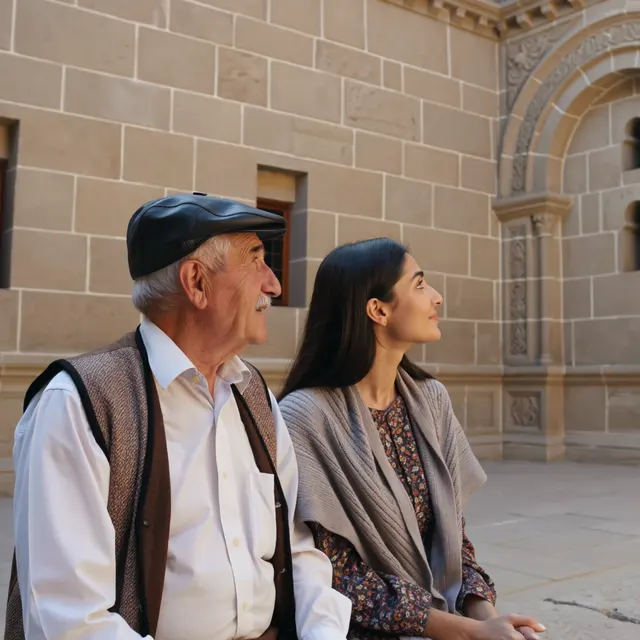
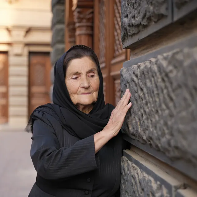
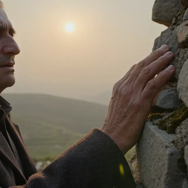
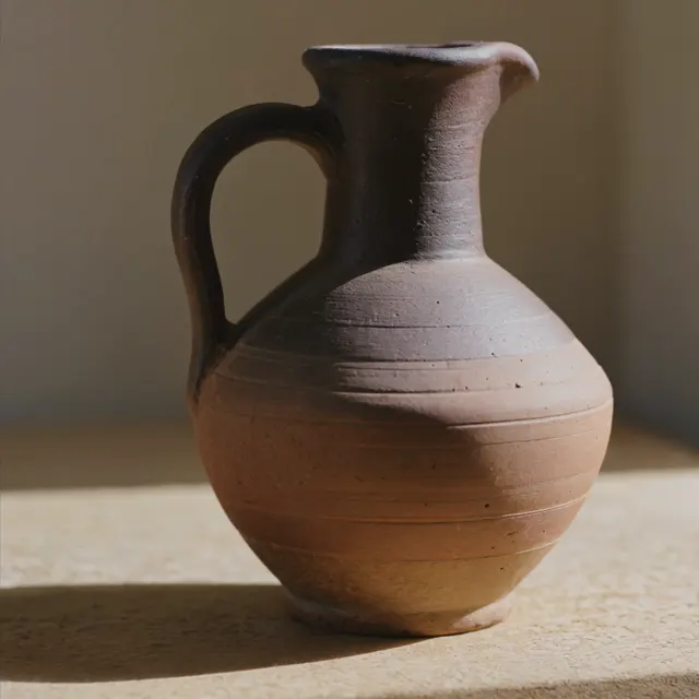
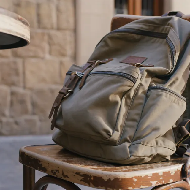
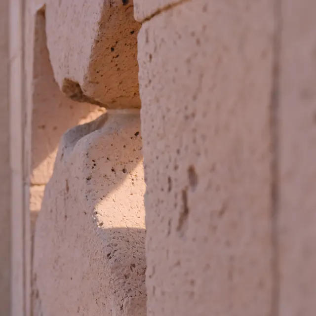
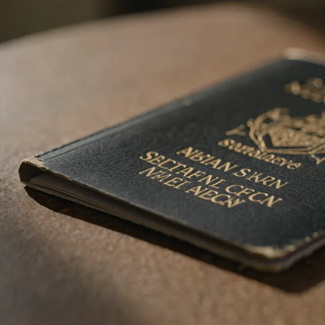
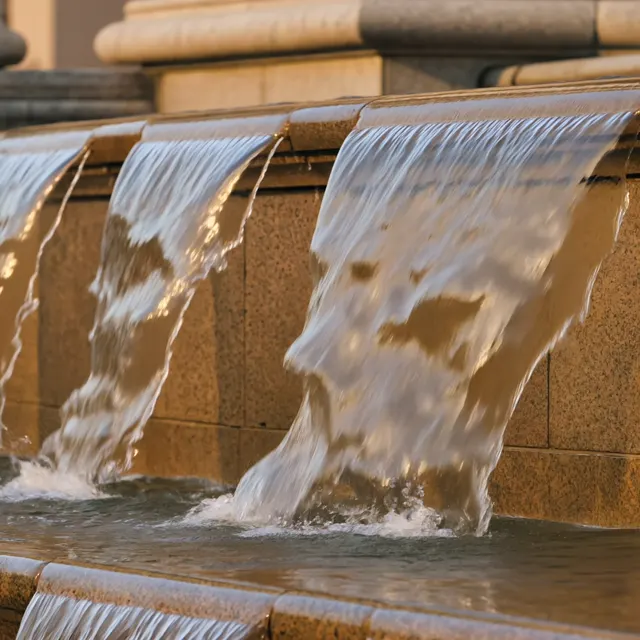
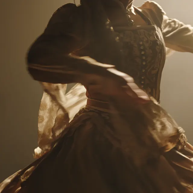
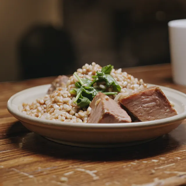
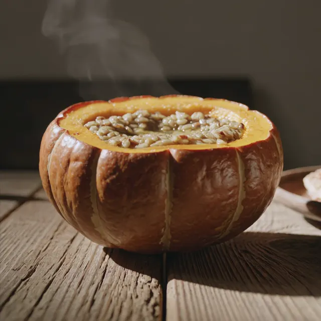
The same object system extends into cinematic, atmospheric and observational video content.
The focus remains on materials, gestures, food, roads, interiors, landscapes and cultural details rather than conventional tourist advertising.




05 / PRODUCTION
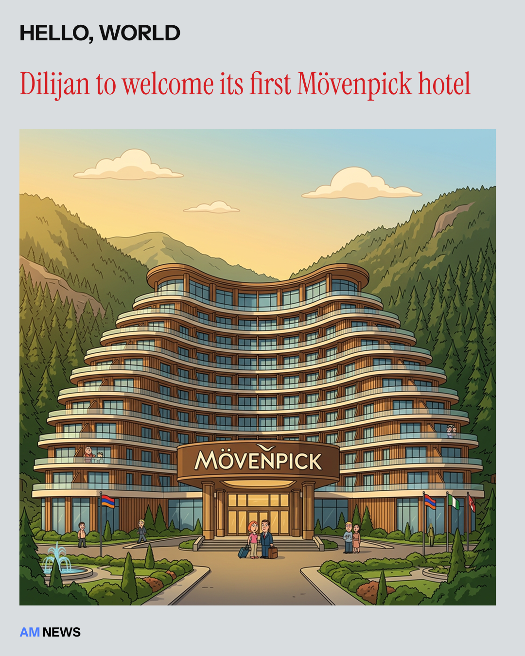
The same system can carry current stories and editorial content about Armenia while staying connected to the broader visual identity.
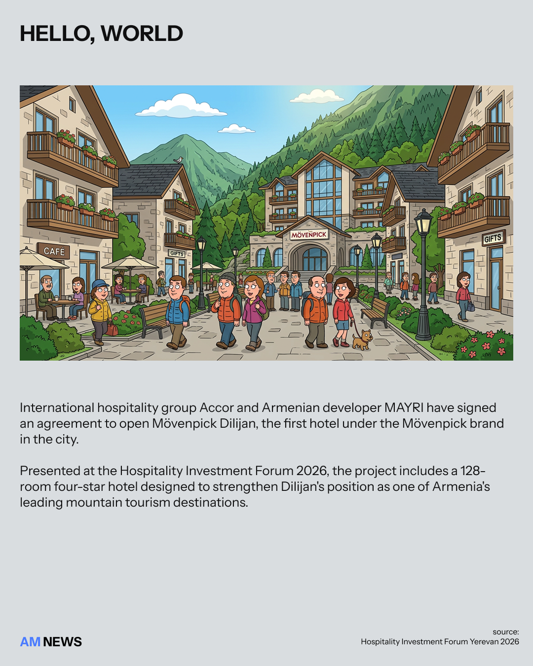
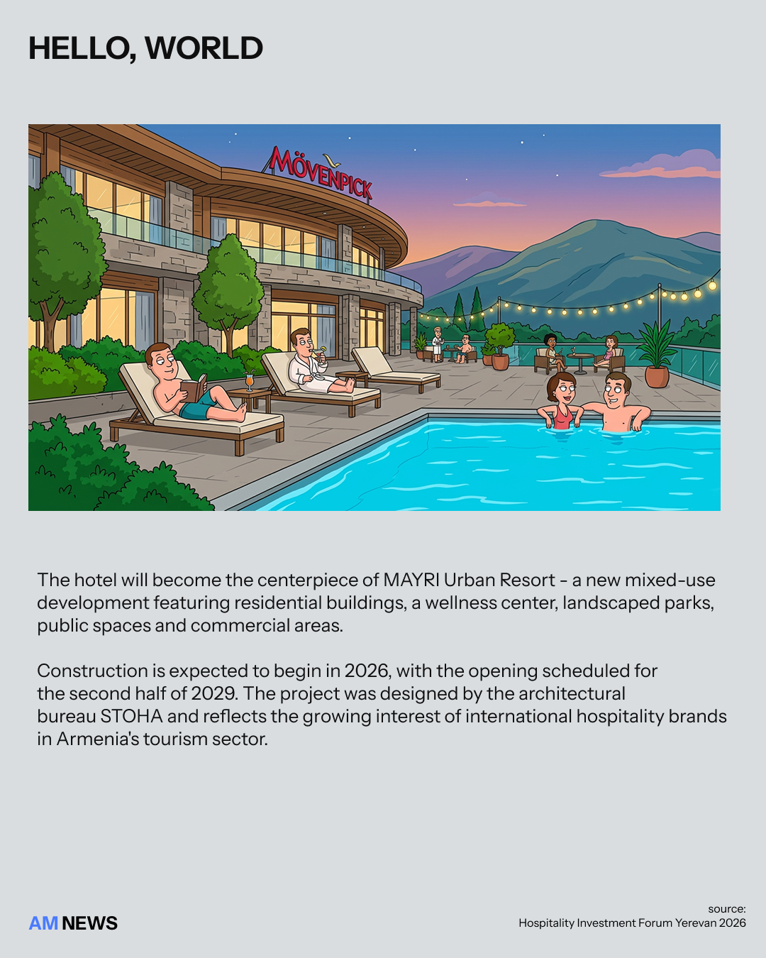
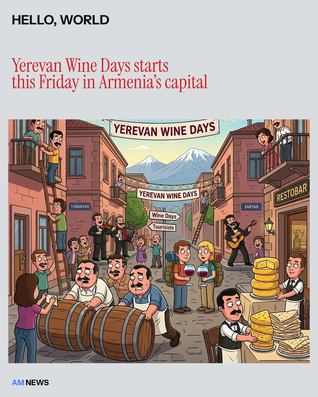
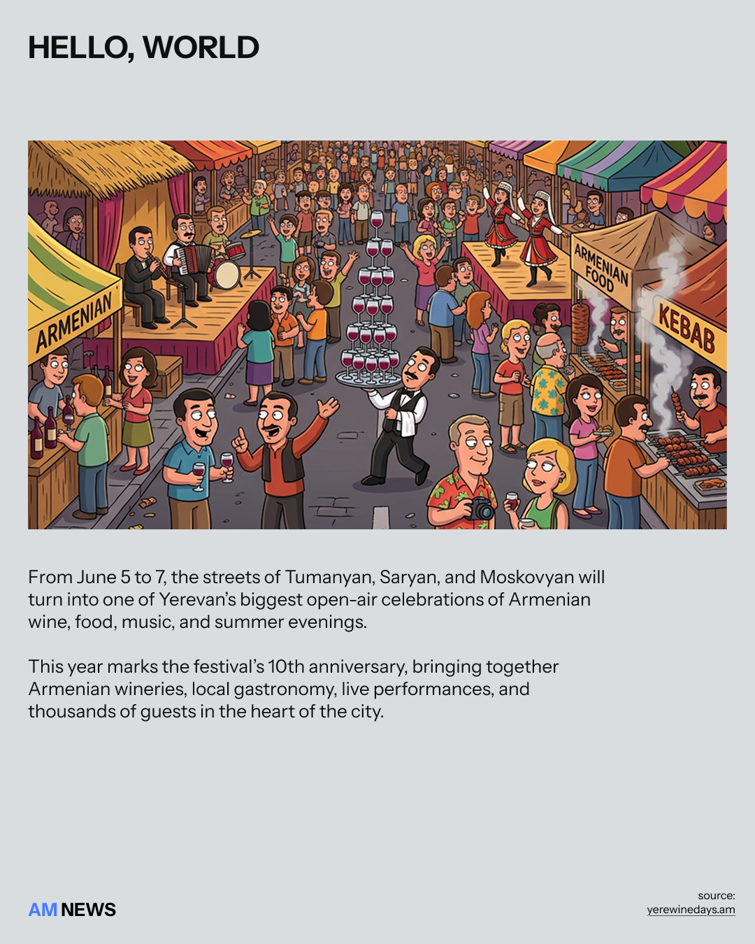
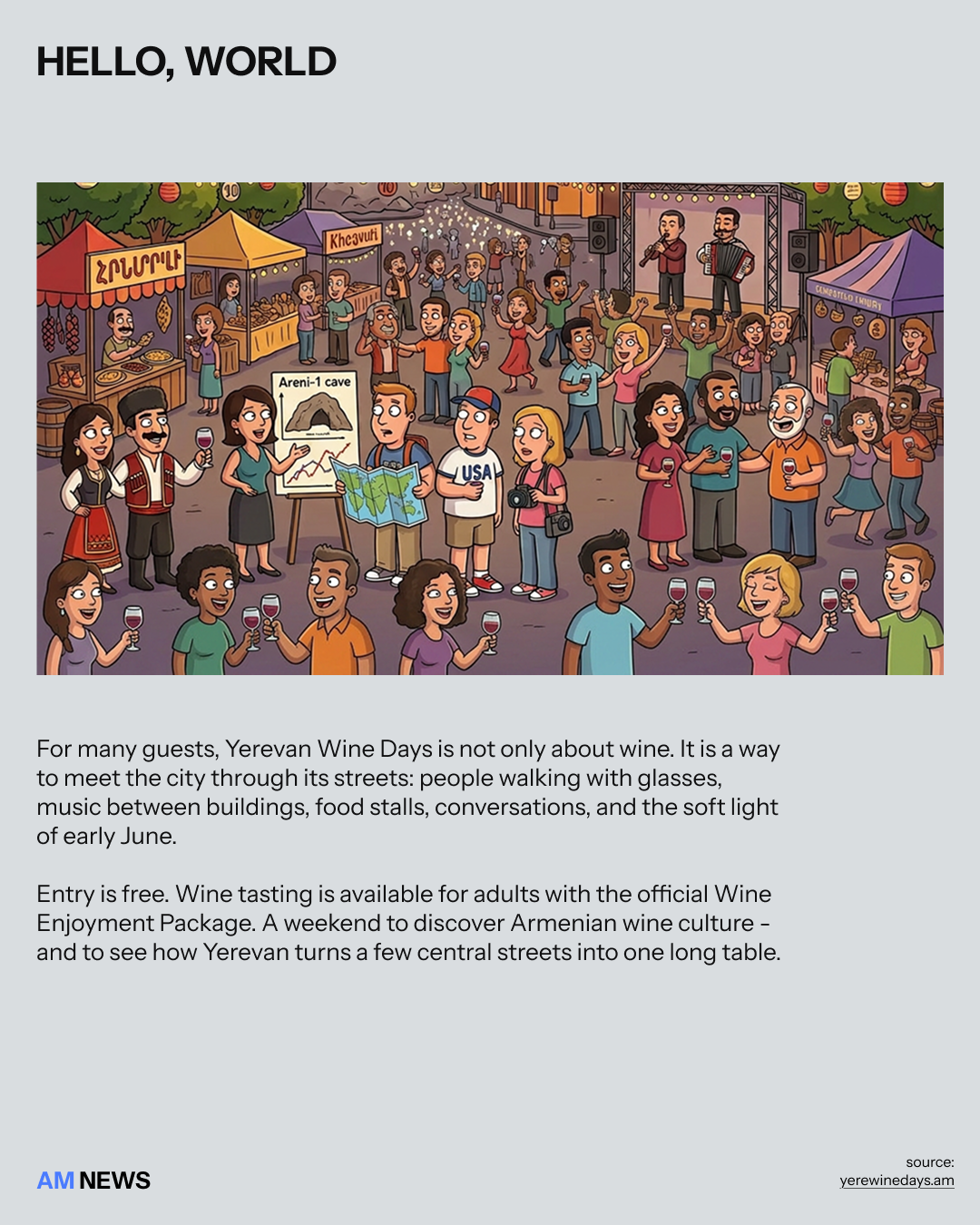
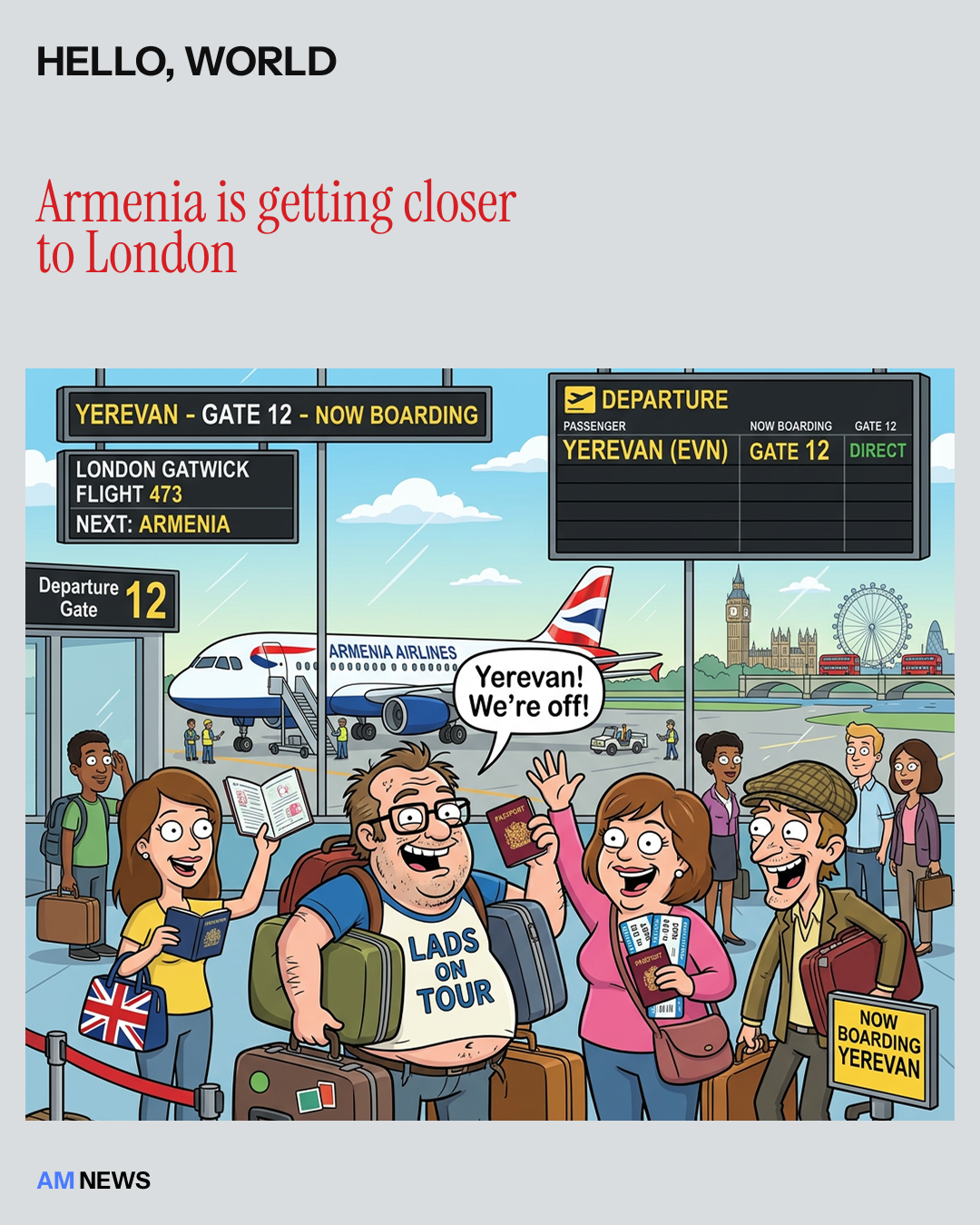
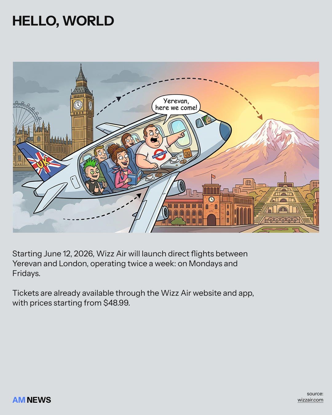
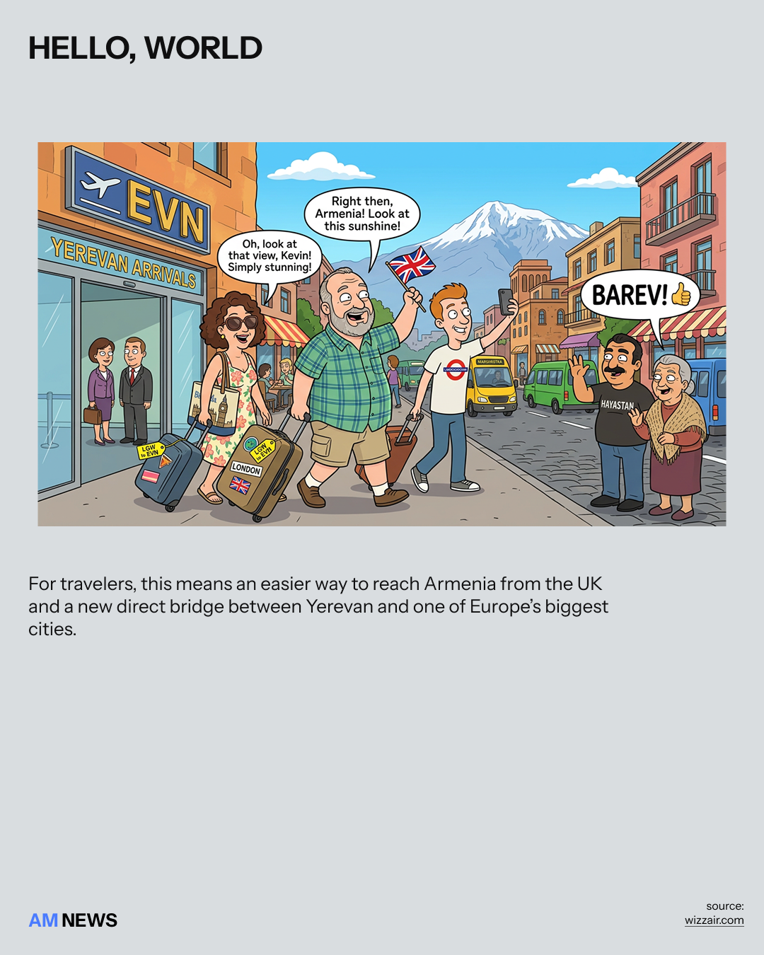
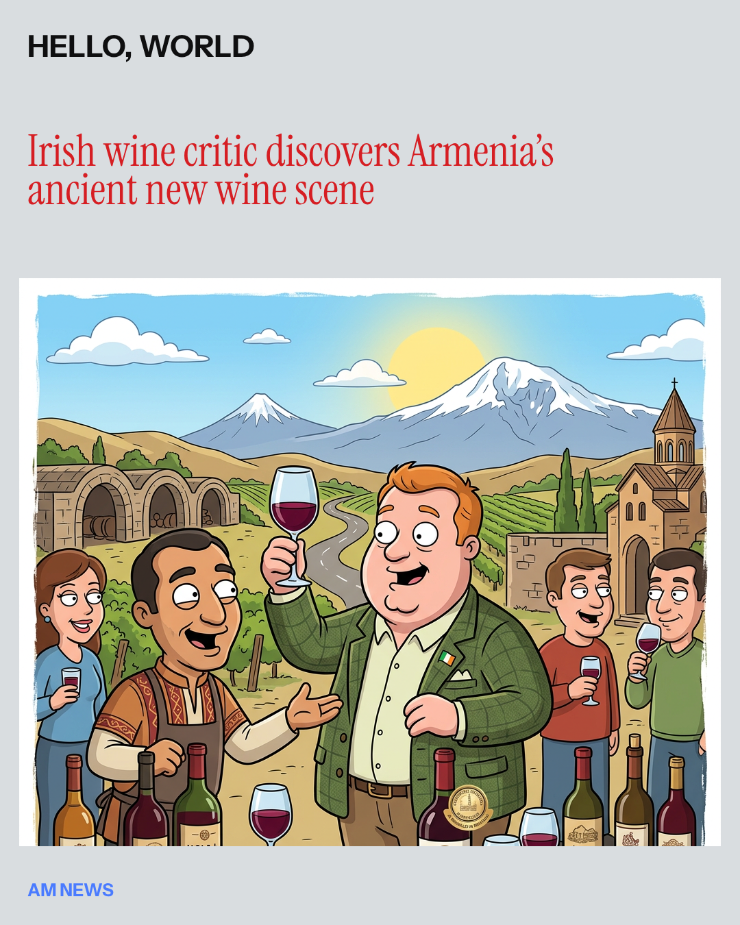
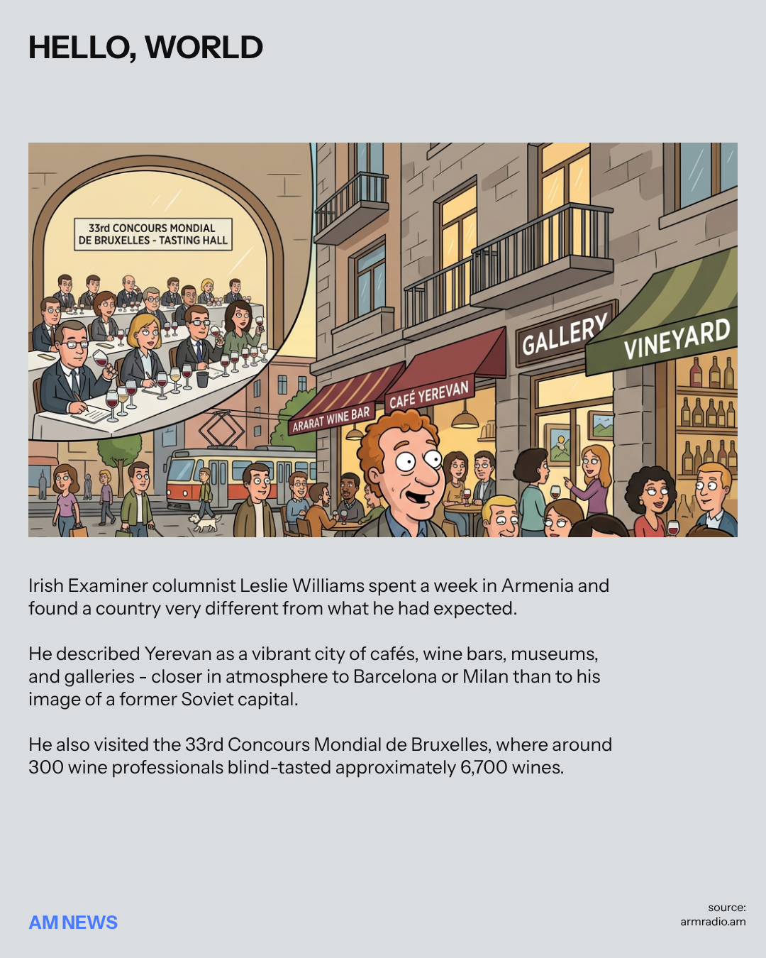
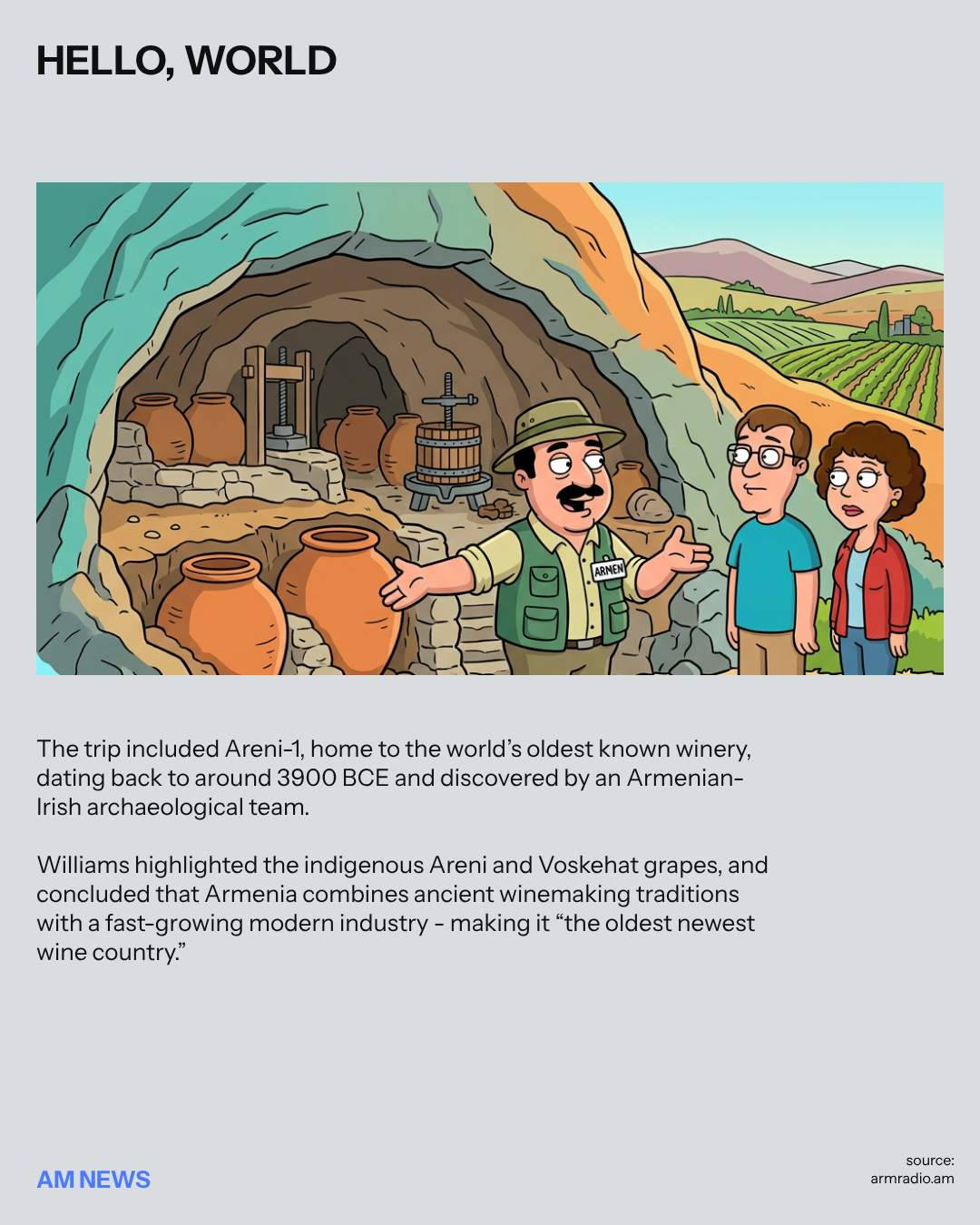
News formats are drawn in a cartoon comic style — bright frames, character-led scenes and short captions that turn headlines into scrollable stories.
07 / WEBSITE
The website brings the same object-led system into a scrolling digital experience for routes, stories, places and trip requests.
helloiam.am
08 / AUTOMATION
The object system was built to be produced, not hand-made. Objects, directions and prompts drive a repeatable pipeline for social content.
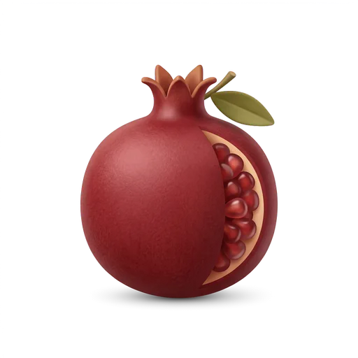
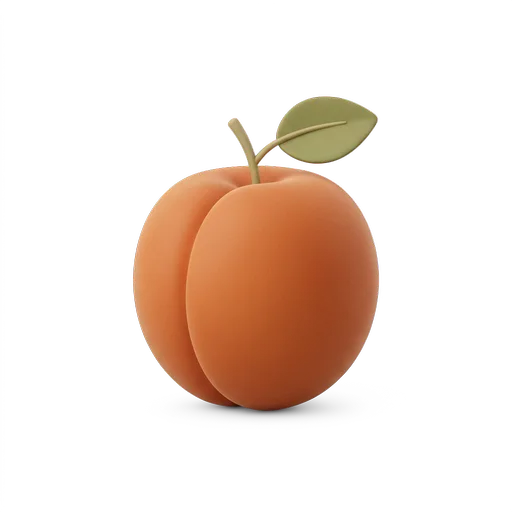
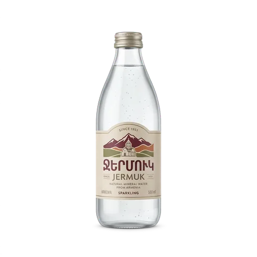
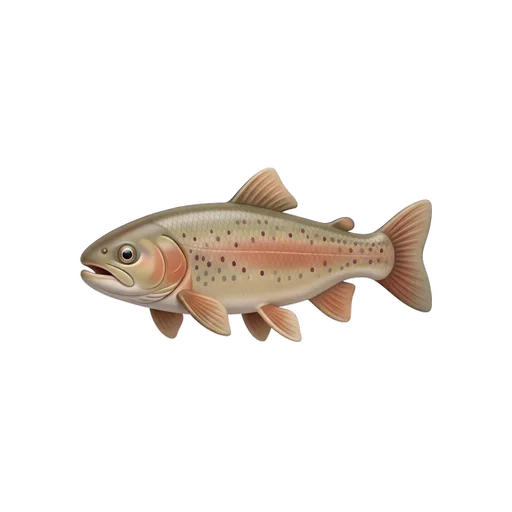
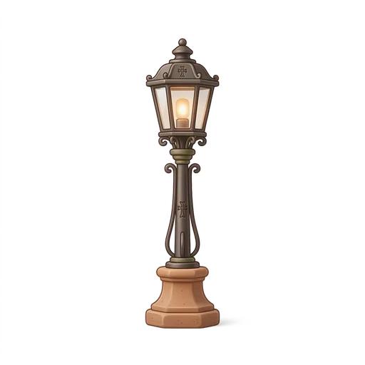
A story starts from the object library — 50 authored emoji objects covering food, roads, places and rituals.
The object lands in one of the four directions, which sets the tone and the caption construction.
The visual is produced against the fixed brand grammar, so every drop looks like the same brand.
The result is cut into the post, the carousel, the vertical video and the news card in one pass.
One object, every channel — the object stays fixed, the crop and the motion change.
TECHNOLOGY
HELLO I AM. AM runs on Content OS, our system for turning one object language into every format a destination brand needs.
The same pipeline supports the object videos, post formats, editorial visuals and website presentation from a shared visual system instead of rebuilding the brand logic for every channel.